MTAA-RR » news » mriver » friday post 03 25 11:
Mar 25, 2011
Simple Net Art Diagram - Notes on Outputs
posted at 13:53 GMT by M.River in /news/mriver
Just as a tangent touches a circle lightly and at but one point, with this touch rather than with the point setting the law according to which it is to continue on its straight path to infinity, a translation touches the original lightly and only at the infinitely small point of the sense, thereupon pursuing its own course according to the laws of fidelity in the freedom of linguistic flux.
— Walter Benjamin (quote used as an introduction to the UEBERSETZUNG IST EINE FORM. | TRANSLATION IS A MODE exhibition)
Using a Creative Commons Attribution 2.5 Generic (CC BY 2.5) license and general lazy disregard, MTAA give our 1997 artwork iThe Simple Net Art Diagrami (SNAD) over to academics, artists and the general public for re-purposing. We hand it over carte blanche. Have at it. Go nuts.
The Simple Net Art Diagram (SNAD) 1997
Along with random Internet re-mixes, we occasionally receive requests to display the piece in physical spaces. In 2006, the first request to show the SNAD in an exhibition came our way. Removed from the context of the Internet and translated into physical form, we began to refer to the non-web displays as outputs.
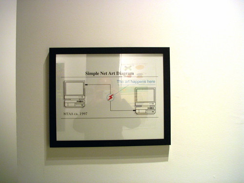
The first request came from Marisa Olsen as part of a Rhizome.org-curated exhibition for the 2006 Scope Art Fair, NY. The request came with the caveat that the exhibition space would not have an Internet connection. For this output, we fabricated a small (20in x 24in) C-Print in a black frame. Although we saw other possibilities and methods for creating a SNAD output, we chose a simple, concise route: print the image; frame the print; hang the print on the wall; call it a day.

In 2010, Birgit Rinagl & Franz Thalmair of CONT3XT.NET asked if weid like to show the SNAD, as well as the 2007 iCommons Art Diagram,i in a show based around the idea of translation. The show was entitled Übersetzung ist eine Form. | Translation is a mode.” We excitedly agreed, though with a catch. As an experiment for both our working process and in response to the theme of the exhibition, we asked the curators to be solely responsible for the output of both pieces.
Recently we asked Birgit and Franz to share their process in preparing these two outputs for the show and how results worked for them as translations.
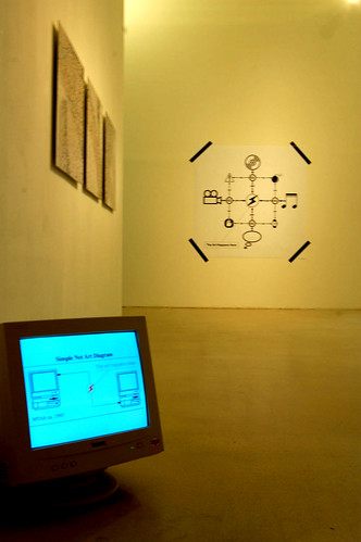
In the exhibition “Übersetzung ist eine Form. | Translation is a mode.” the SNAD was presented on a CRT monitor known from the mid-1990s. Thus, the display refers to the date of the origin of the artwork. The monitor, simply placed on the floor, was connected to a computer hidden behind the wall of the exhibition space to be unviewable from the visitors point of view. The SNAD was shown as a fullscreen version of the animated GIF with its characteristic red flashlight blinking in the middle of the diagram. The EPS-files of the artwork were downloaded and enlarged to the size of the computer screen to guarantee a high quality reproduction. The CAD was presented as a printed black-and-white poster with the format of 150 x 150 centimeters. To emphasize the ostensive casual and ephemer character of its display, it was fixed on the wall with four stripes of black Gaffer tape. The CAD was installed nearby the computer based installation to make both diagrams viewable at the same time — but not in line and with a spatial distance.
It was important for us to show both diagrams in order to focus on the historical dimensions of the artworks and to give an insight in how the mode of the Internet has changed over ten years lying between their releases. Our intention to show the SNAD as a computer-based installation was to keep its original characteristics and to transfer the typical format of general Internet-based culture — the animated GIF — to the exhibition space. Although we basically try to avoid presenting Internet-based Art on computer screens to distinguish the modes of viewing in virtual space from those in real space, we decided to show the SNAD — dated with “ca. 1997” — in its ‘original’ context. To reinforce the idea of this very early context of Internet-based Art — we selected one of those yellowish and heavy computer screens, dating from a time when there was no talking about flat screens, mobile devices and portable mini screens.
In contrast, we presented the CAD as a large paper print: this artwork does not have animated traits and it is downloadable as a static file. The display of the CAD was originally thought as a simple poster. During the process of installing the artwork we figured out how it communicates with other artistic diagrams shown in the exhibition. To avoid a form of presentation much to neat and clean for an open source file — which has been shown in so many different contexts and in so many different formats — we decided to stuck it onto the wall with black Gaffer tape, normally used for the temporary fixation of cables and other loose objects. Thus a kind of temporary situation was created — referring to the ephemera functionality which can be found in the popular cultures of the Internet.

The Winter of 2011 brought about the third output of the SNAD . The exhibition, iGraphics Interchange Format,i centered on artistis use of animated GIFs. Paddy Johnson of Art Fag City asked to show the SNAD as an early example of artists using GIFs as stand-alone artworks. Again, we agreed and left the output method and results in her hands.
We asked Paddy to describe the physical installation, her thought process on around the SNAD output and to compare the installation with viewing the work online.
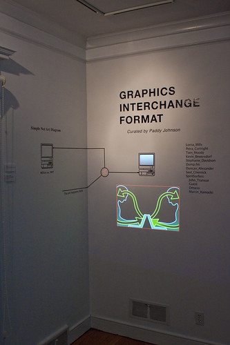
The installation is at Denison University’s Mulberry Gallery and the exhibition design is fairly clean. There were a number of ways I could have gone with the design in this respect but I decided against a messier look because it didn’t suit the displays for the work. Also, I wanted the exhibition to be accessible even to the complete novice. I got lucky with the wood floors as a cement floor would not have created nearly so inviting a space.
The decision to mount SNAD on the wall was a collaborative one that came out of discussions with Christian Faur, the director of Mulberry Gallery. I knew I wanted the display to reflect the spirit of SNAD, which is to say I wanted to contribute to an ongoing conversation the GIF has inspired. For this reason we did not display the GIF on a monitor but recreated it using vinyl lettering that stretched across two walls. We recreated the flashing lightening bolt in-between the computers as a means of indicating that we too located art as a communication point but that it wasn’t a principle guided by a single technology. This is a guiding principle in the design of the show. While Graphics Interchange Format highlights GIF making in the art making community, the exhibition itself does not limit itself to displaying work in that medium. So long as the original file inspiring the work is a GIF, the work is fair game.
Viewing SNAD in person is very different. Online a viewer is looking at a representation of what they are doing and using. Offline the image tells them what they have or will do. In each case though the work tells us where to locate art. Today, that message couldn’t be more relevant.
 permanent link to this post

MTAA-RR » news » mriver » friday post 03 25 11